Rachio
 The Rachio Smart Sprinkler Controller changes the way you water.
It makes running your sprinklers easy and convenient while saving you water and money
App Features :
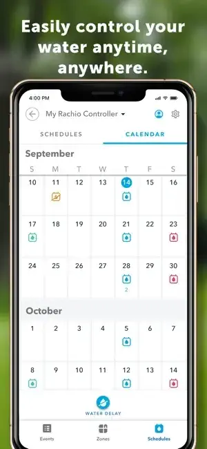
Rachio automatically creates a watering schedule that lowers your water bill and ensures the beautiful yard you want, while the mobile app gives you access to your sprinkler system from anywhere. Plus, Rachio is compatible with nearly any sized yard and smart home platform.
This is the companion app to the industry-leading Rachio Smart Sprinkler Controller.
Additional Information :
- Size 164.2 MB
- Requires iOS 14.0 or later.
User Reviews :
Works like a charm
Very easy to set up. I like that you can take photos of your zones, create zone maps using an aerial photo of your home, etc. It is really easy to use as hoc and in scheduled mode. Many devices are one or the other, but this is eased or both. This is real easy to use with Alexa too. Will just say, “Alexa, ask Rachio to run zone 3 for 15 minutes.” Also, I like that I can VERY simply select certain of the zones to run manually (quick run). Literally can have that started in 10-15 seconds of zone selection time. You can also allow professionals (your landscaper or sprinkler repair company) to access it. This allows them to work on your sprinklers without you having to give them your phone. I gave this a 5 because it’s not a 4, but I think it is really a 4.5. So far I can’t fully trust the automatic weather feature. I am all about using water only when needed, but in our climate, if you give too little everything will die. I noticed that it won’t run the sprinklers when the slightest bit of rain has recently occurred. That slight bit of rain would never have been enough to get to the roots of the plants / grass. The good news it is a easy to use that I turned off the auto weather feature, and I just manually disable the Rachio if enough rain has occurred or is obviously going to occur.
Controller works acceptably; app has major issues
The app has an annoying habit of going to a completely blank screen (on iPad Pro using iOS 12.4) at least once a day whenever I switch from a screen (for example, changing a watering duration in a given zone) back to another screen (like ‘home’). There is only a white screen with a smallblack line across the bottom center of the screen. Nothing works to get the app to respond except to delete the app and load it anew from the App Store, which gets old very quickly. Additionally, its ability to postpone scheduled waterings based on upcoming weather forecasts of rain is too dependent (100%) on a weather service, which historically is nowhere near that perfect; while it is relatively easy to override such a “rain skip” of a scheduled watering by clicking on a “run” button, that has become the antithesis of automated watering for me in five months of usage in the DFW Metroplex. It is actually proving to be easier and more efficient to turn OFF all of the apps vaunted watering aids and do a manual shut-off when experience shows heavy rain, saturated ground or high winds
Developer Response,
Shoot! I’m so sorry to hear about this, friend. This is not the norm and should not be happening. I’ll be sure to send your feedback to our iOS team to see if we can replicate it and get this fixed.
I apologize again for the frustration.
Best,
Lo
Rachio Team
Difficult to Navigate
Mechanically, electronically… the system is reliable and durable. However, the App could be a little easier to navigate. (I have been in IT since it was called Data Processing, used punch cards, etc., and involved main frame IBM water cooled 360s, etc. – 1980 …yes, I’m old, 77).
Often, a firmware update will sneak-in a new feature or move ‘things’ around, to help the user, me, intuitively find where to make sprinkler, drip watering scheduling adjustments, etc., and I have to try to re-find where i have to navigate to do it this time, then re-train my poor brain in order to accomplish a simple task that i used to know how to do. This sometimes results in irrigation changes i did not intend to make and weeks later i discover them, then i have to re-learn the user interface to try to figure out what i screwed up, where in the numerous areas i was when i messed things up, then how to ‘fix’ the problem i created for myself.
REQUEST: Rachio User Interface programmers: Please incorporate user-selectable feature ‘explanations’ that can be accessed by easily tapping a ‘?’ Symbol next to the feature in the App’s user interface.
You’ll be helping me to reduce my numerous therapy visits to the local ‘Asylum’, and my dog won’t be so nervous.
Get Rachio from App Store
What is your opinion about Rachio
